
Making Sense of the Data
There's been no shortage of data flying around to help characterize what's happening right now. None of it is really a huge surprise, but it's helpful to look at these different charts as a way to internalize the severity of the dislocation happening.
At a simple level, there's a change in consumption, even a reversal of a 20-year trend in spending at grocery stores vs. restaurants:
Reversed a 20 year trend in weeks.
— Austin Rief (@austin_rief) May 5, 2020
h/t @Alex_Danco pic.twitter.com/C7Rk8Mjk3W
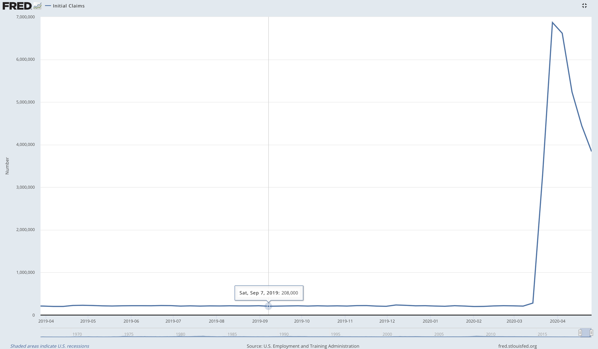
And of course, we have record unemployment, of which there will likely be more coming:
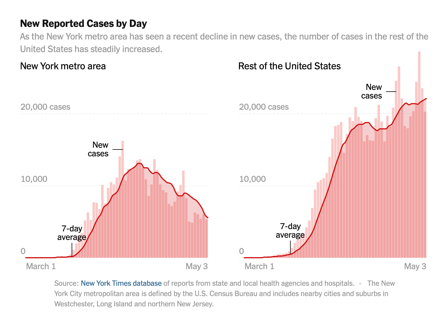
Looking at Covid 19 cases is a bit trickier due to a number of factors.
For instance, not everyone is getting tested, so there's an argument that generally speaking the total cases are undercounted. Further, the availability of tests hasn't been constant, so one could argue that of course there will be more cases as tests become increasingly available.
All that said, it looks like NYC is generally seeing a decline in cases while the rest of the US is still increasing.
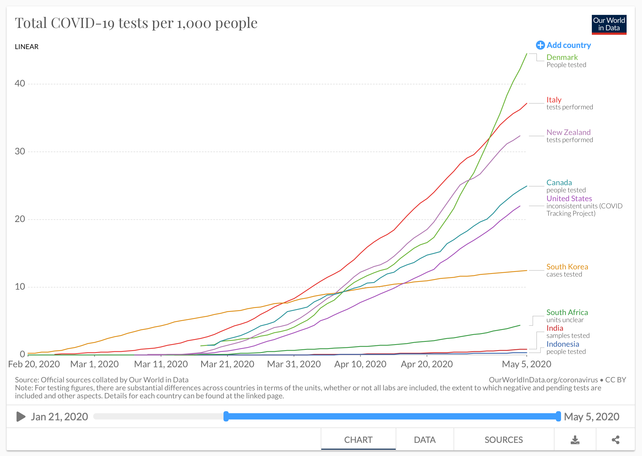
On that issue of testing, here's how the US fares in terms of testing relative to other countries, normalized per 1,000 people:
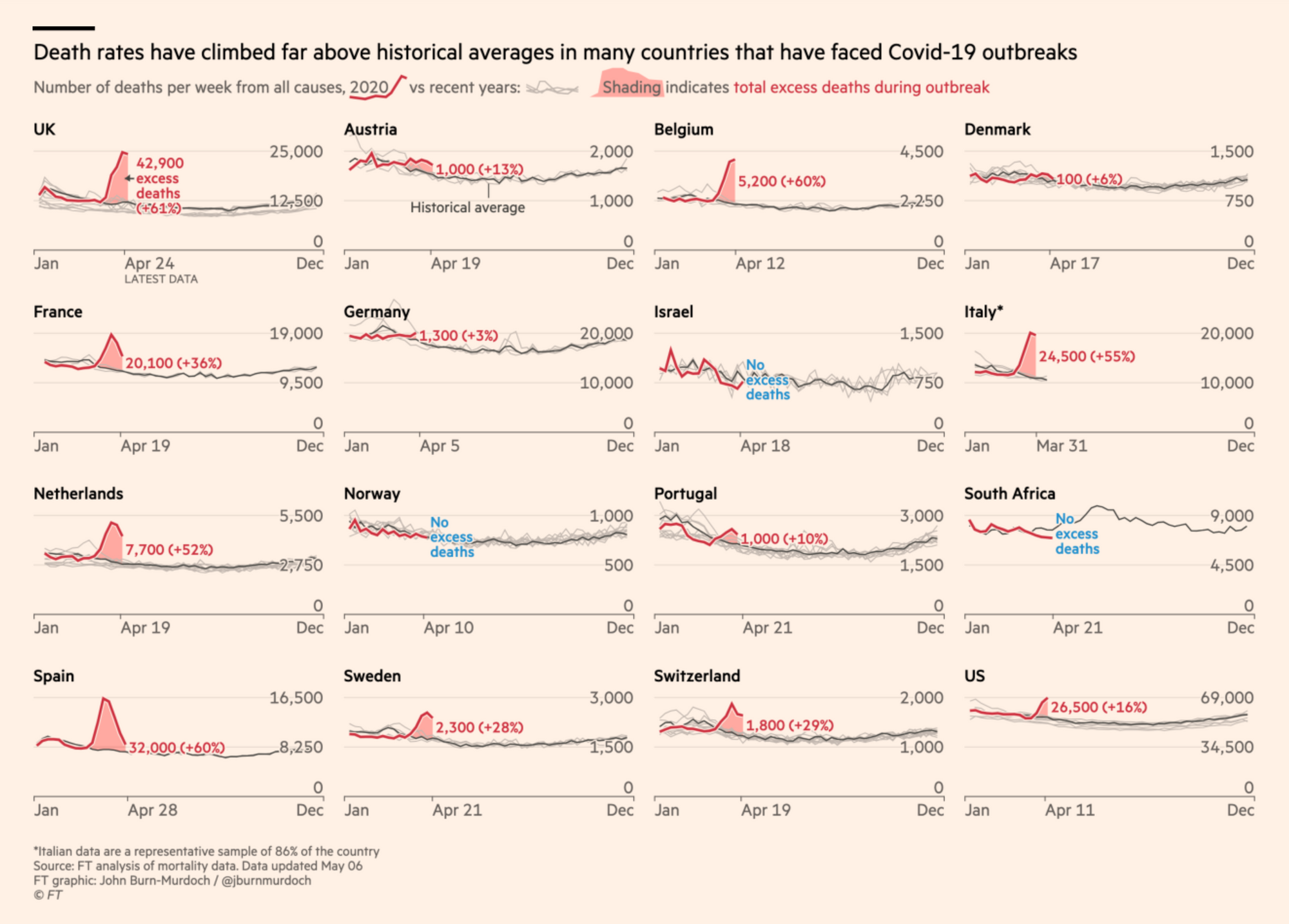
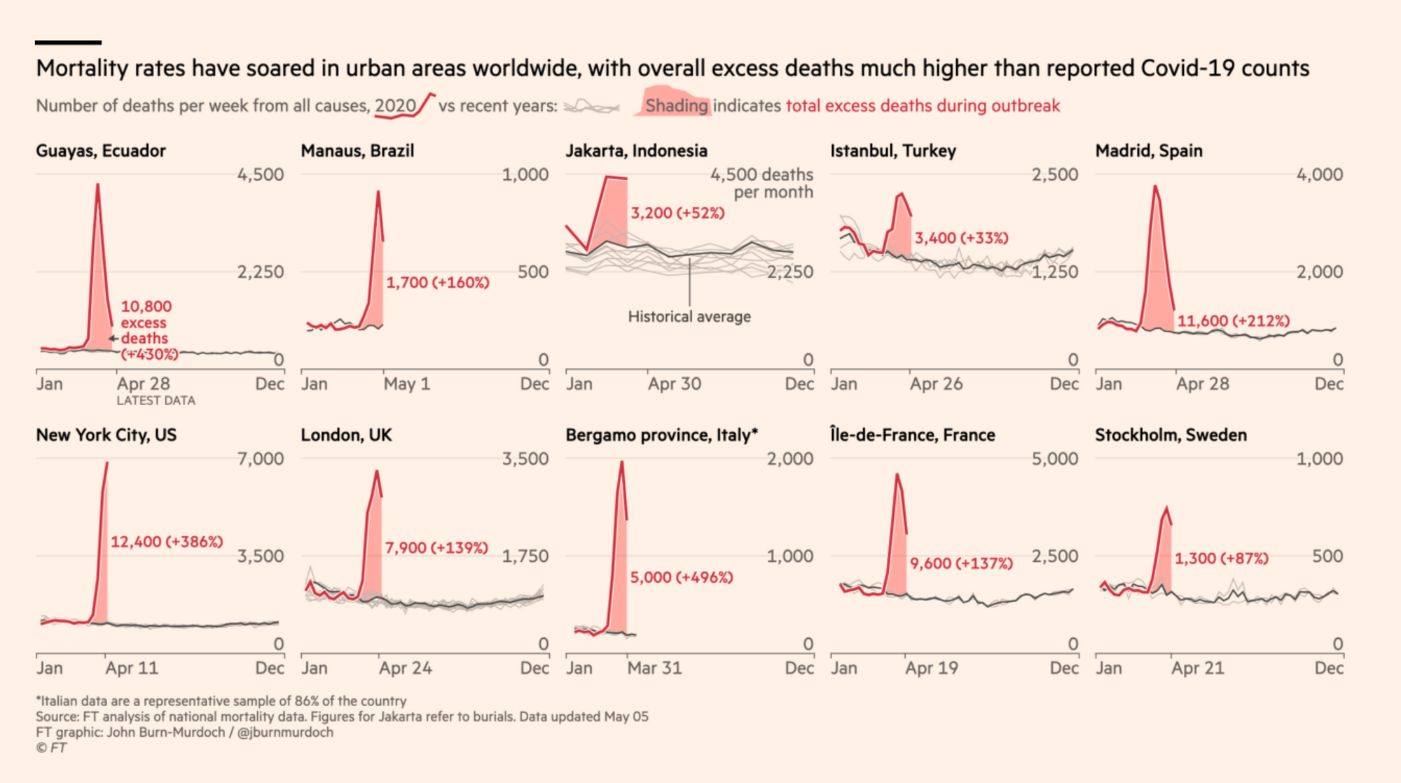
I think the most sobering metric is Excess Deaths—the number of deaths higher than normal.
This metric feels a bit more meaningful because it theoretically accounts for the discrepencies in looking at reported cases mentioned above as well as any inconsistency with respect to differentiating between deaths with Covid 19 vs. deaths caused by Covid 19.
The NYC chart is so off the scale that they had to get creative with the layout of the page:
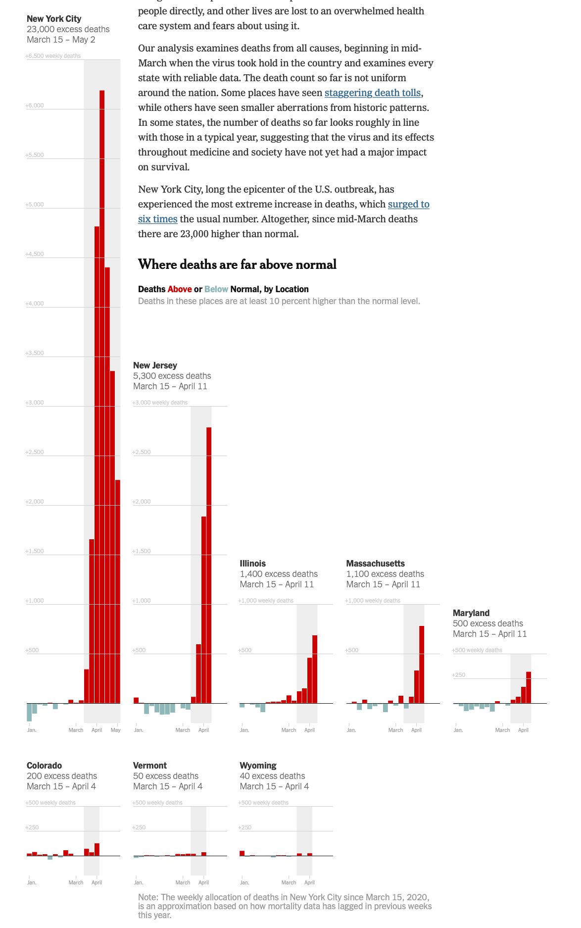
This is just one group—the excess cases. The rest of the article shows the other groups: states where deaths are slightly above normal as well as states where deaths look about the same as previous years.
The Financial Times has been looking at excess mortality as well, and have their own tracker.
Here's what excess deaths look like internationally at both a country level:
as well as at a city-level:
Probably the most depressing data from the Financial Times analysis is that the US is lagging behind the rest of the world in terms of both deaths (which are overall decreasing) as well as new cases:
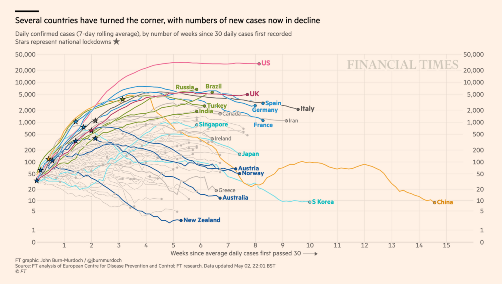
If you consider that the the US is still under-testing, it's pretty clear that we have barely begun to scratch the surface of the impact in the US. This curve should be going down.
Underlying all of this are the sources of data, which in the US depend solely upon what the states are reporting. The COVID Tracking Project—which is a whole interesting project to explore in itself—has been leading the way in terms of making data available and accessible for journalists and others. Notably, they've also started tracking and reporting data by race, which is important given that the long-standing institution of racism has an adverse effect on who is vulnerable, who does or doesn't have access to adequate testing and healthcare, not to mention who makes up the primary population of frontline essential workers.
While the quantitative data has been easier to aggregate, work with, and scale, the qualitative has been incredibly important, too.
The best source of qualitative data by far has been Twitter, and I've found both the official news reporting along with individualized stories from Twitter users to be helpful in crafting a picture of how this is affecting people both inside and outside of my social circle.
That, however, is probably a topic for a separate post altogether.
Generally speaking, though, it feels like we're just getting started in the US, and things are going to get a lot worse before they get better.
Club history is often remembered through the shirts worn in decisive matches because personalised names and numbers add another layer of memory to a kit. Conversations about third kit design help explain why two shirts from the same club may appeal to different fans. Among the options linked to club identity, Manchester United away shirt remains part of the discussion around teams, seasons, and supporter culture. The design conversation adds context around collecting, gifting, and choosing a team shirt.